Brand
Hāpai Public
IPANZ is New Zealand’s independent national body for public sector professionals. To increase engagement with their 50,000-member base they needed a new name and a refreshed brand identity that was more reflective of their membership base.

To successfully shape the brand identity, we needed to hear more from the organisation’s members. To kick us off we ran a series of research evenings with public professionals who told us they had a deep passion for the work they do and a desire to see the brand be more welcoming, diverse and modern.
Under a Te Ao Māori-led guidance we developed a bilingual name, ‘Hāpai Public.’ The new name weaves together Te Reo and English. In Māori, ‘Hāpai’ means to support, shoulder or lift while ‘Public’ is a nod to the organisation’s members and their sector.
The new brand puts members at the centre. We used event and portrait photography to give the brand a humanistic feeling and reflect the increasing diversity of the public sector. We also chose a vibrant colour palette that conveyed energy, optimism and freshness.
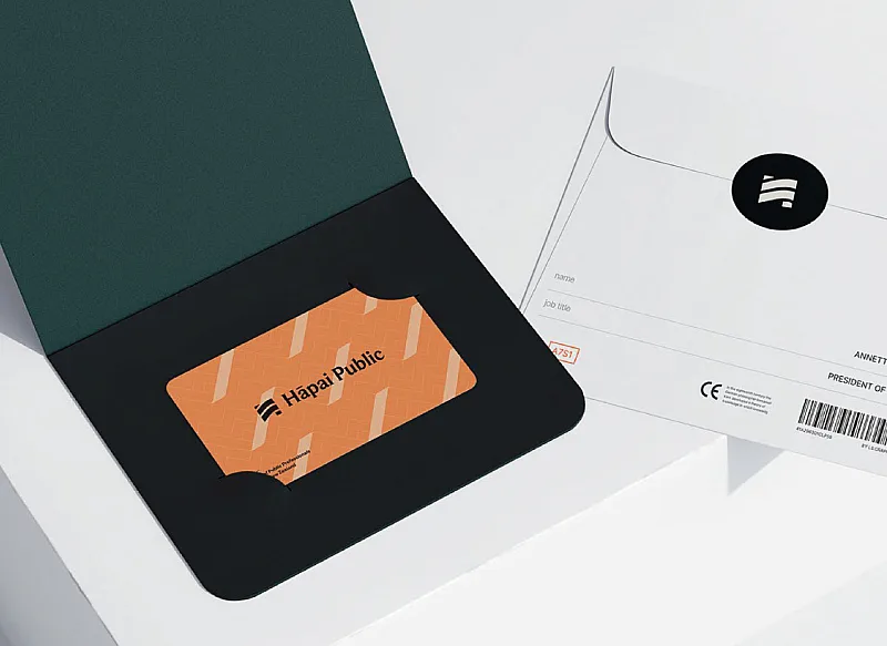


Pattern design incorporates the weaving of harakeke, symbolising strength and unity. The Hāpai Public logo represents the uplifting of ideas and the coming together of people from all walks of life.
Gentle Dental