Supertec
Supertec is New Zealand’s most powerful investment administration tool. Our client came to us to generate brand messaging and visual identity. The new brand needed to communicate the unique benefits of their in-house software tool.

Our process began with a brand essence framework. We identified the unique selling propositions that would help differentiate their brand from its competitors. We also identified brand archetypes to help define Supertec’s unique personality and tone of voice. The core essence statement of the brand became ‘manage your members, simply efficiently’ articulating the message that the product makes streamlining, managing and processing tasks that much easier.
We brought this idea through into the visual identity by developing a logomark using simple shapes to represent the concepts of simplicity and efficiency. Automation, customisation and agility are represented through a visual system of squares, arrows and circles using solid colours and small groupings of shapes.
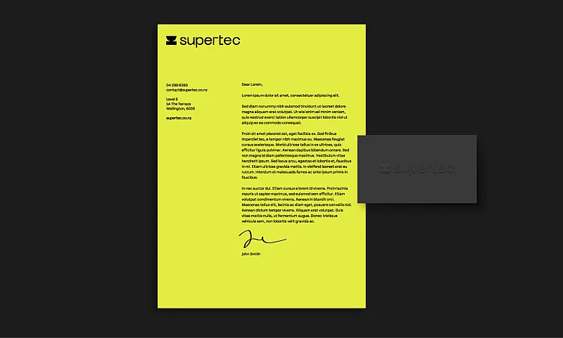
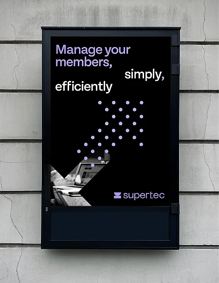
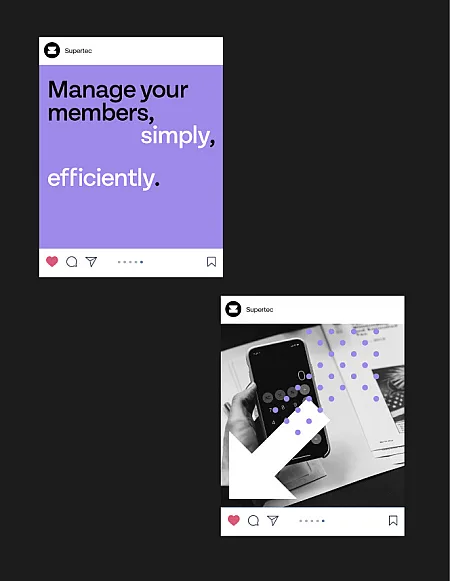
We chose a palette of bright orange, yellow, vibrant blue and purple to represent technology, innovation and modernisation. This gives the brand a contemporary, elevated feeling.
Te Tiriti Is Us
Te Tiriti is Us, a not-for-profit project opposed to the ACT Party's Treaty Principles legislation, reached out to us for help with their campaign. Their grass roots movement was gaining steam, but they were having problems reaching a broad audience with such a delicate political subject.